Home / Artwork / Animal Life
The Wader’s Search
Oil on Linen, 30”x40” - $2800*
*Price includes professional framing. (Note: Listing photo shows the unframed canvas for clarity.)
The Wader's Search
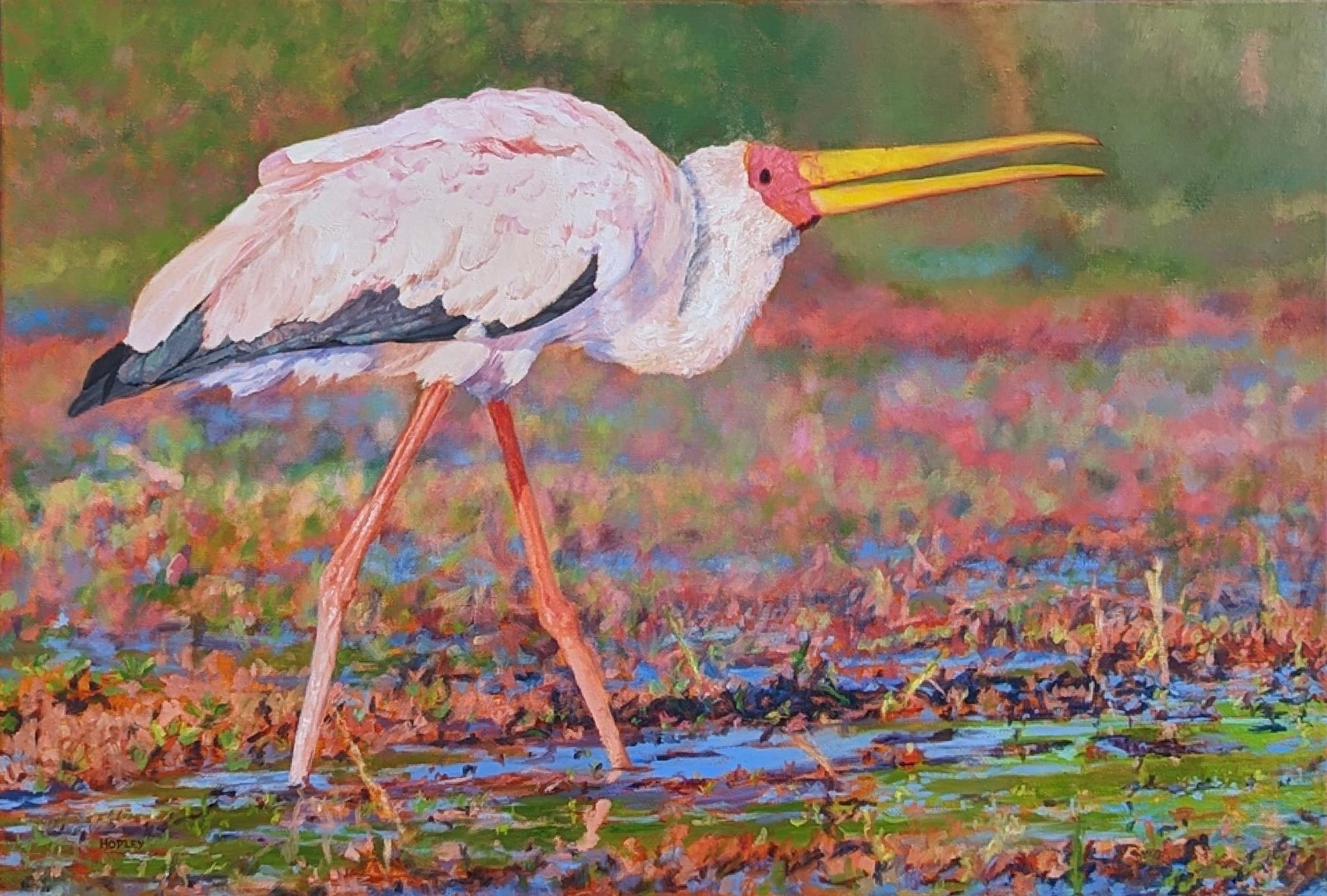
This painting is an exploration of the vibrant complexity of natural light and colour, capturing a magnificent stork in its element. The subject is captured mid-forage, its striking tones contrasting with a tapestry of grasses and lichens — a challenge that, while daunting, was irresistible to capture on canvas.
The stork's focused posture echoes its unique foraging method: deftly jabbing its long beak into the water, often relying on touch rather than sight to spear its prey.
Artistically, I worked to convey this dynamic energy through bold, direct brushwork. Painting the white of the feathers was a lesson in observation—like painting snow, the whites are not pure, but reveal subtle pinks, mauves, and soft orange hues reflecting the environment.
To build the rich tapestry of the environment, I used a methodical layering technique. I carefully mixed my greens for the dark feathers, starting with Cerulean, Ochre, and Raw Umber for warmer tones, and Cobalt for the cooler greens. For the reds in the scene, I layered cooler pinks and reds next to blues, followed by warmer reds, a technique that helped prevent unintended muddy tones.
I hope you feel the sense of joyous discovery and awe that comes from witnessing such a magnificent creature bathed in a moment of unforgettable light.